
ESMA
- Nov 23, 2016
- 2 min read


Ligature Logo Project:
Date: November 23rd 2016
What is a ligature logo?
Ligature means to tie. Letters that are tied make a compact signature perfect for companies that are known mainly by their initials. They require no special drawing talents, just an ordinary sense of rhythm and an interest in putting puzzles together. Some letters link naturally while others do not. Some can be linked in one font but not another. Others link in lower case but not upper.
How would describe the corporate identity of ESMA in 5 words?
I would describe the corporate of ESMA would be best described as “new, fresh, young, trendy, and hip” I would use these words because not only do they descried the company but they can also be used to descried the music that the company produces.
Which logo out of the two do you feel is the strongest and why?
If feel that my second design is stronger than the first. This design removes a stroke from the “A” in ESMA and provides a younger look that people may find relates the company more. I also feel as if this design is stronger because I found this one to flow more than the first. I struggled a lot with the first one and getting it to work. I also feel as if the colors on the second one are stronger than the first.
If you had no requirements or restrictions how would your logo look different?
My logos would look different because I would not have made a color version for my first design because I feel that the design is stronger without the color and I really struggled to find a color that worked well with it.
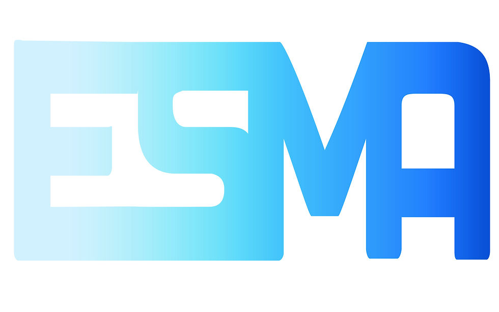
Explain which ligature techniques you have demonstrated on each logo:
In the first design I used overlay to connect the letters in clean way that made the logo easy to read. I also used the ‘S” to connect the “E” to the “MA”
In the second design I used remove a stroke from the “A” and connected it to the “M” and I also used Horizontal Crossbars to connect the “E” to the “S”.


Comments